
What is Contour?
Contour is a point-and-click analytics tool in Palantir Foundry. It lets you analyze large-scale tabular data and create interactive dashboards.
Contour is often one of the first applications in Foundry that new users are exposed to. While some people quickly understand how to use it, many face a steep learning curve because Contour is different from tools they already know.
Recently I recorded an extensive 40min tutorial, “Contour 101”, that shows you how to use Contour’s core features. This blog post is a shorter companion piece to that video for anyone who prefers text to video.
Contour vs Quiver
Quiver, Foundry’s other main point-and-click analytics tool, is similar to Contour in certain ways. At the surface, both can let you accomplish many of the same tasks: analyze data, create charts, publish interactive dashboards, etc.
The main difference is in which data you can use in which app (and how they run the computations is different, but that’s beyond the scope of this article).
If you want to analyze objects in your ontology or you want to work with timeseries data, use Quiver. For datasets, use Contour.
Starting an analysis
There are two main ways to start an analysis.
One: open Contour and start a new analysis, then picking the data you want to work with.
Two: find the dataset you want to start with and open it in Contour
You can add additional datasets as needed throughout your analysis.
Paths & Boards
Your Contour analysis is organized into Paths. These are like worksheets in Excel or another spreadsheet software. Each Path starts with one dataset.
They’re called Paths because you start with the input dataset at the top and add data visualizations and transformations one by one in sequence. Each of these steps in a Path is called a Board.
For example, you might first add a Filter Board to get rid of some rows. Then you might add a Chart Board to plot the data. If you then change what you’re filtering on, the chart will update to show the new data. Everything runs top to bottom. If you add another Filter Board below the chart, there’s no way for that filter to affect the chart due to where it sits in the Path.
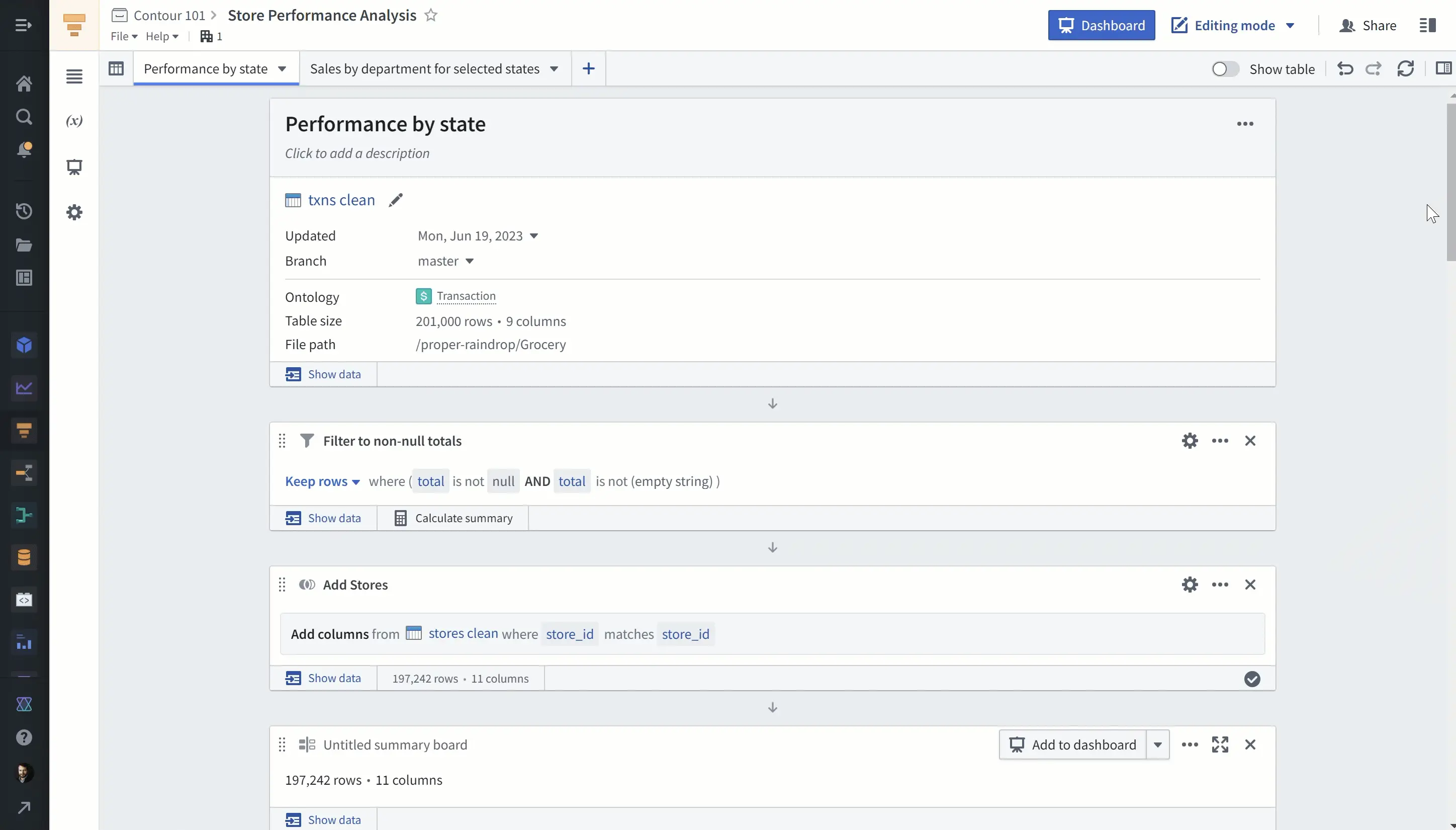
Boards that Display data vs. Boards that Transform data
Although the Boards menu has several categories, I typically think about just two: Boards that display data and Boards that transform data.
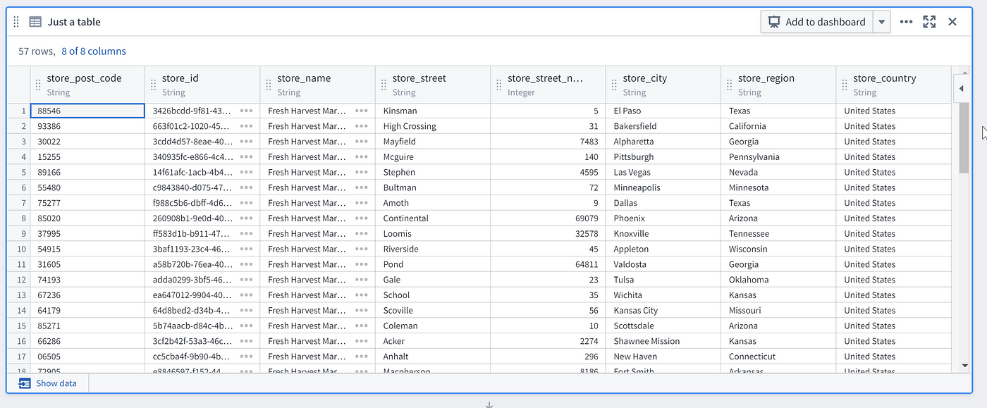
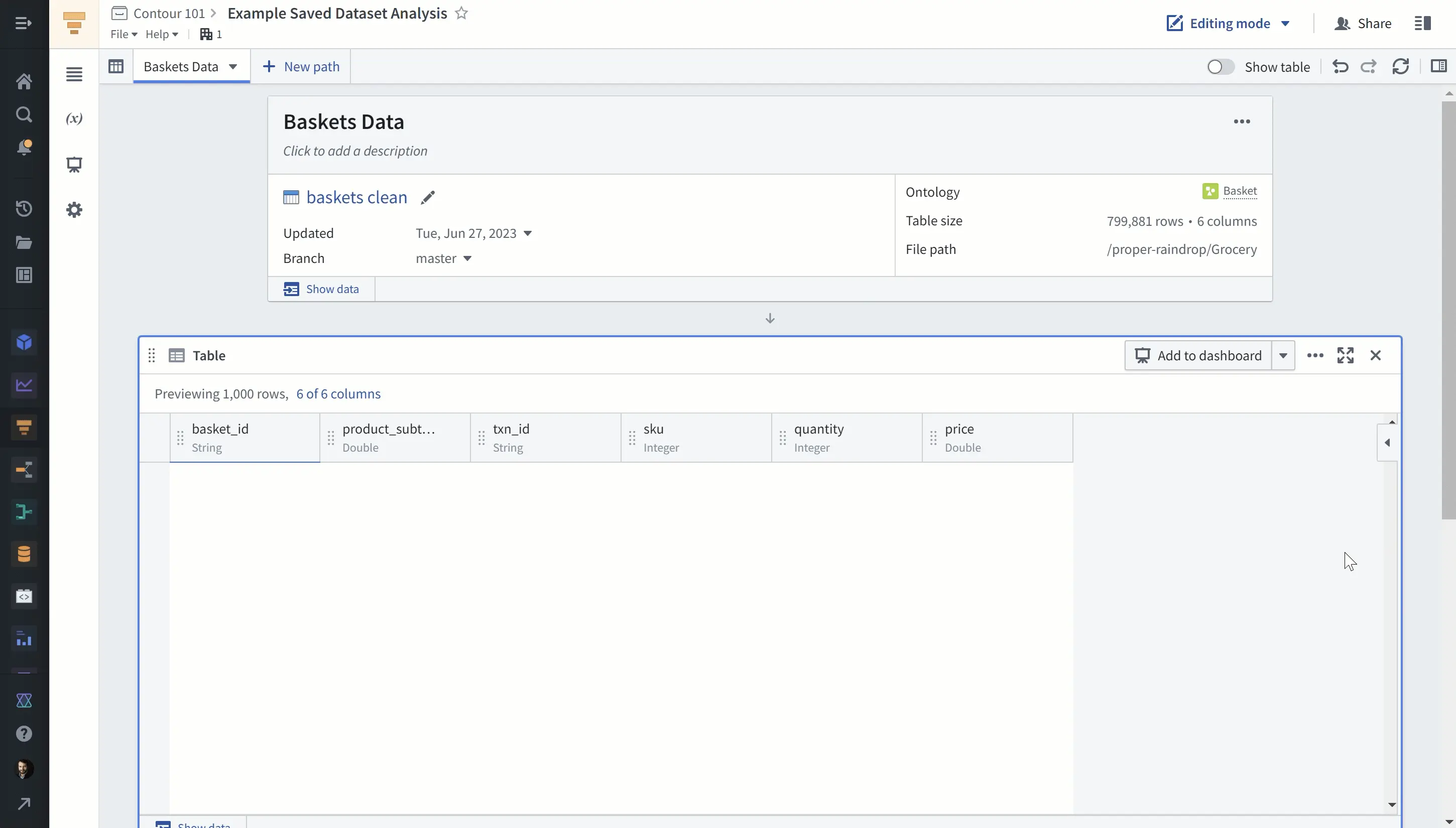
An example of a Display Board is the Table. It just shows the data in a table and doesn’t change the data in any way.
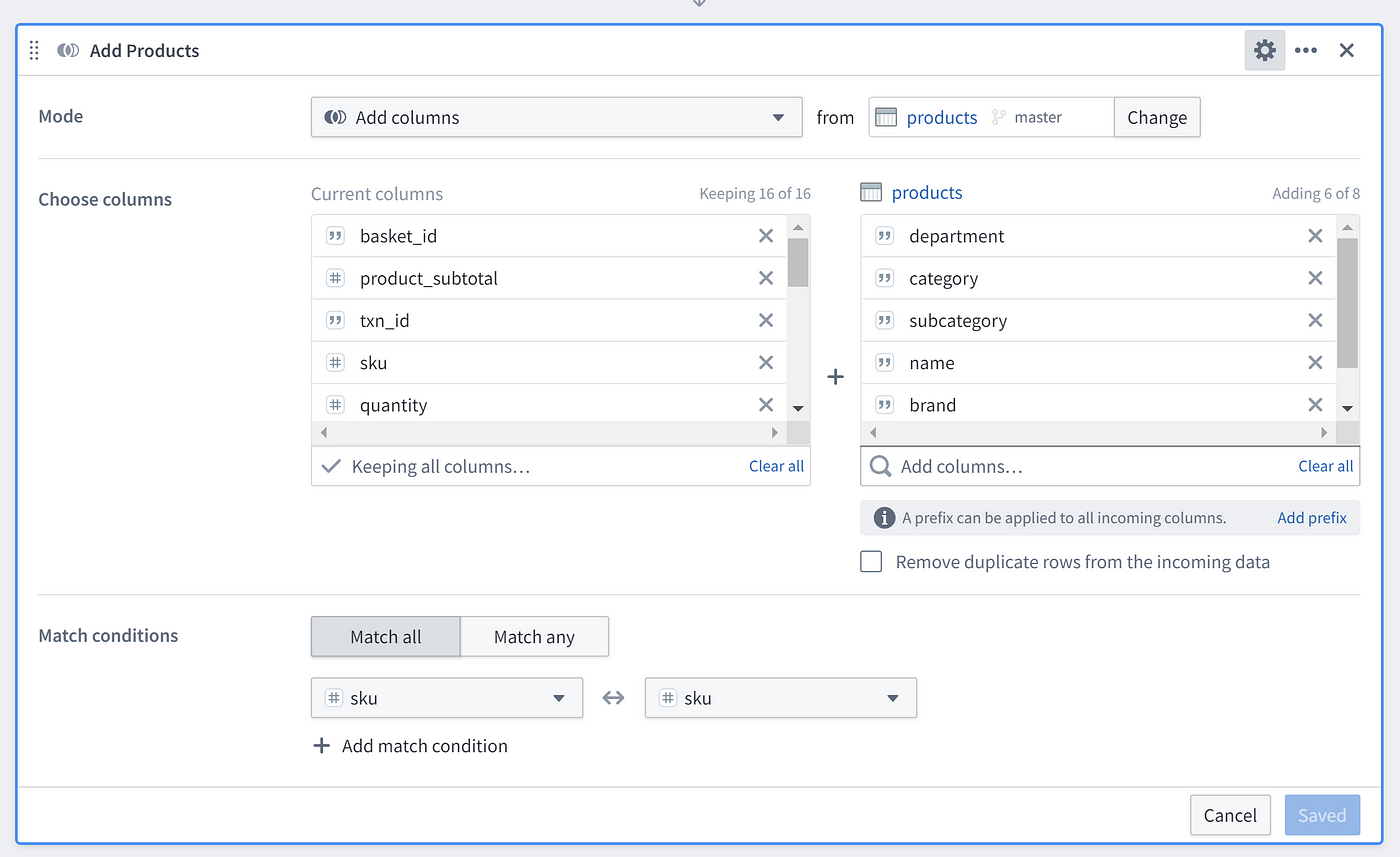
An example of a Transform Board is the Filter. It changes the data by removing rows that meet whatever criteria you specify. Another example is the Join Board, which changes the data by adding columns from another dataset.
The reason I group Boards into Display and Transform categories is because in my experience, one point of confusion for people is the fact that some Boards (the Transform Boards) affect the in Boards below them while other boards (the Display Boards) don’t.
For example, someone might add a Filter to check something specific about the data but then forget that it still applies as they continue adding more Boards. Those Boards will seem incorrect but the user won’t realize that it’s because the Filter board they added above is affecting everything below it.
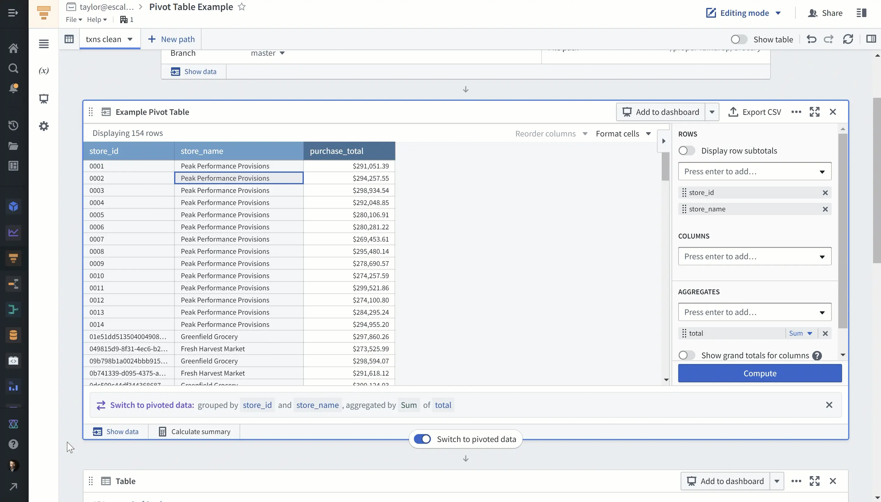
Some Boards can do both
The Pivot Table can display data in a pivot table format and it can change the shape of the data if you click that option. Or, the Chart board can filter data if you select data in the chart.
Saving Datasets
At the bottom of your analysis is the ever-present Results Board. It represents the current state of the input data after applying all the transformations (Boards) in your Path.
You can save this as a new Dataset, which is handy if you want to use this data in another application, export it from Foundry, preserve it for future analysis, or create a clean dataset specific to your team’s needs.
When you save a Dataset, Foundry will use the logic of that Path to Build the Dataset. That is, it will run all the Transform Boards in order and save the output in the Dataset you just created.
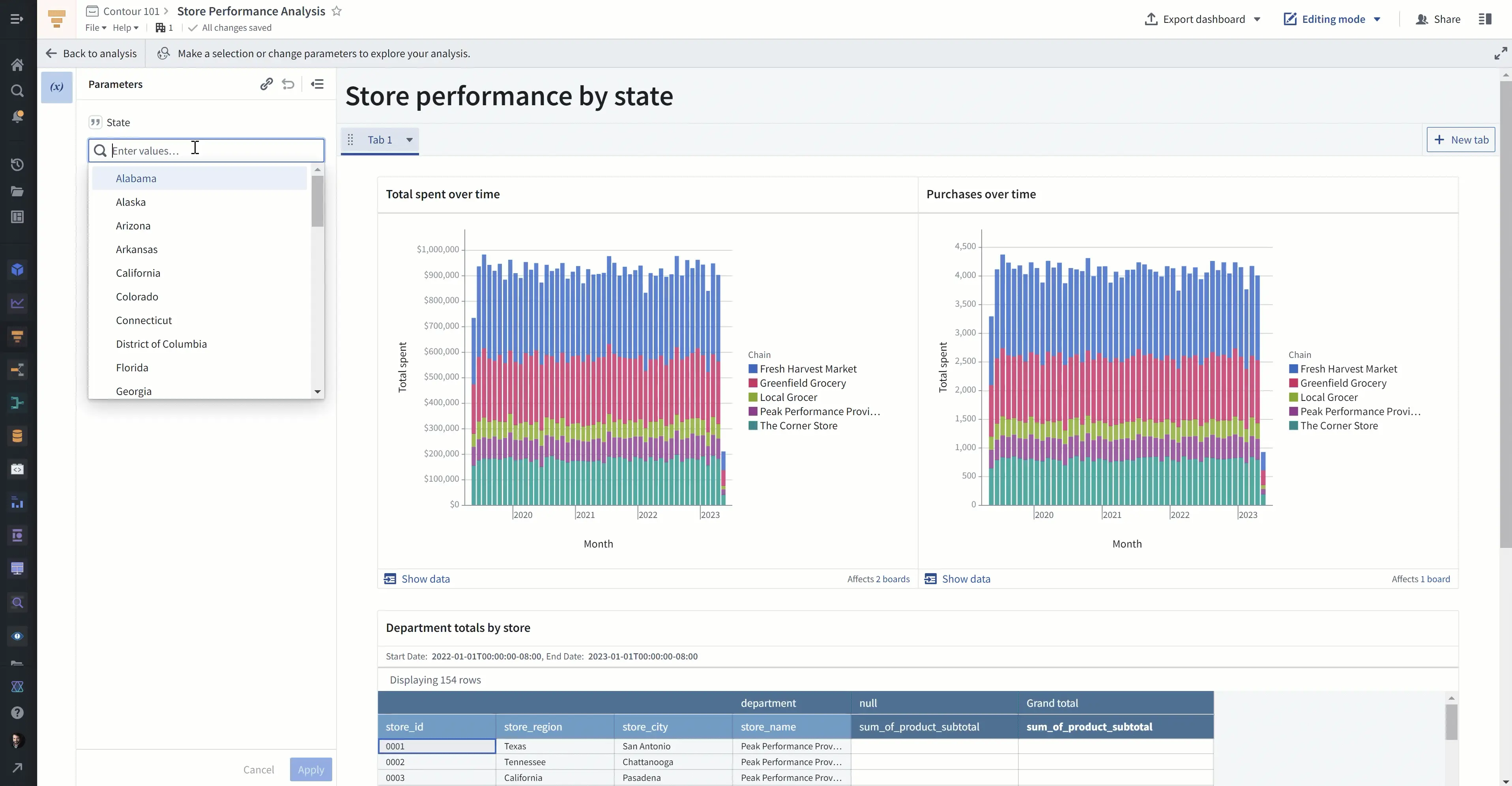
Dashboards
Contour also lets you create Dashboards. Each Contour Analysis lets you create one Dashboard.
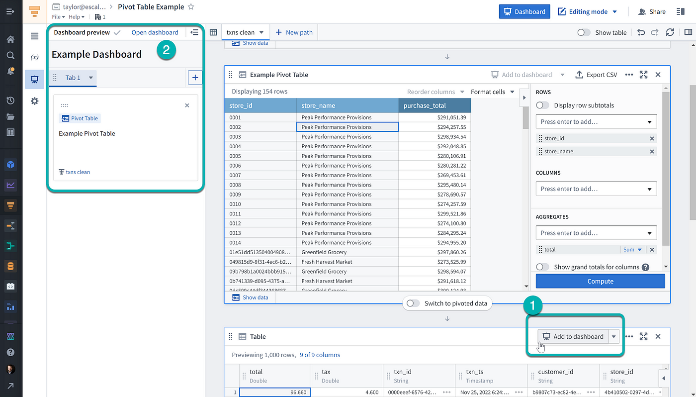
You can add Boards to your Dashboard by clicking the “Add to Dashboard” button. Only Display Boards have this button.
On the left-hand side of your screen you have a list of Boards in your Dashboard.
When you enter the Dashboard, you can move Boards around, change titles, add text, and prepare your Dashboard for others to use. Dashboards intentionally have relatively limited formatting capabilities. If you need something pixel-perfect, you may want to consider another tool such as Slate (which is normally for app building, but can also be used for dashboards) or an external tool that connects to Foundry such as PowerBI.
Parameters
Parameters let you define a value in one place and use it multiple times throughout your analysis. Parameters are especially useful for making Dashboards more engaging.
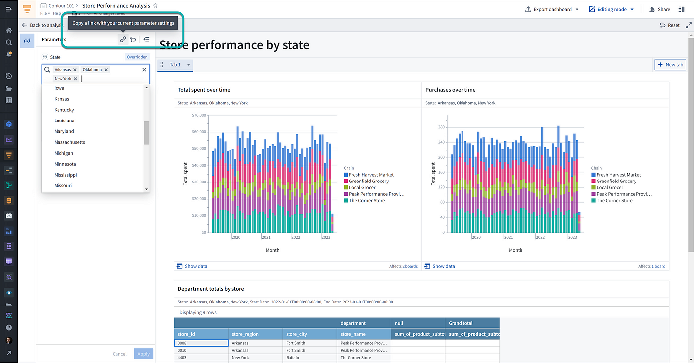
For example, in the video tutorial I create a state parameter that lets uses pick multiple states from a list of all US states. The charts in the Dashboard then update to show only data for those states.
You can also use Parameters in your analysis. For example, if you need to filter data but you need to try many values to figure out what the right one should be, using a Parameter in the Filter Board will save you from having to open the Path that has that Board, scroll to the Board, click to edit the Board…you get the point.
Sharing Your Analysis
You can share your analysis so that others either have edit access or just view access.
For Dashboards, you probably want to share view access so that colleagues can interact with the data by changing parameter values (for only themselves), but not edit the underlying analysis. You can easily do that by sharing a link to your analysis. If you want people to open the analysis in dashboard mode, you can change that in the settings panel.
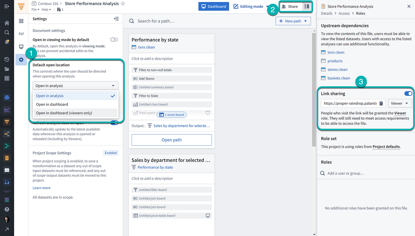
You can send a particular view of the Dashboard to someone by sharing a link generated by this button in the Parameters panel.
If you want to collaborate on the analysis with someone else, you should grant them editor permissions. If the project you saved the analysis in gives edit permissions to your teammates by default, then they will already be able to edit your analysis.
Additionally, you can set the analysis to open in viewing mode by default. This is useful for analysis that you do want people to have edit access to, but which shouldn’t normally be changed.

Parting Thoughts
This post is just a quick summary of how to get started with Contour. I’ve seen people make some incredibly sophisticated and influential analyses in Contour once they’ve worked with it for a while and learned its more advanced capabilities.
Let me know if this raises any questions about Foundry that you’d like answered — you can email me at taylor@ontologize.com or message me on LinkedIn with suggestions for future tutorials.


